EdAider
UX/UI design for a web app that helps teachers and mentors understand their students better
Project Details
April 2020 - September 2024
UX/UI Designer
Overview
EdAider is a research-based startup company that develops web applications for the education sector. During my time at EdAider, I had the opportunity to work on many different projects and take different roles. Below is one of the projects I worked on.
Project: Analytics page (Wellbeing app)
One of the key value propositions of our educational platform was its ability to collect and present student feedback to teachers in a meaningful way. As part of the existing learning platform there was also a page called "Analytics". Its aim was to turn the raw data into actionable insights and:
• helping teachers improve their lessons
• adapt their teaching styles to each student
• identify students who might be struggling both academically or emotionally
Problem
After each lesson, students completed a short survey to share feedback with their teachers. However, this feedback difficult to interpret. Teachers needed a clear, actionable way to spot trends and make informed decisions quickly.
The first version of the Analytics Page attempted to solve this by showing the highest and lowest scoring parameters per subject, with detailed views for deeper analysis.
As the platform evolved, new data types were introduced such as daily morning screenings, short check-ins designed to help teachers understand their class performance for the day. This meant the original design could no longer be useful: teachers now required a dashboard that could not only display different types of data, but also translate them into insights they could act on in real time.
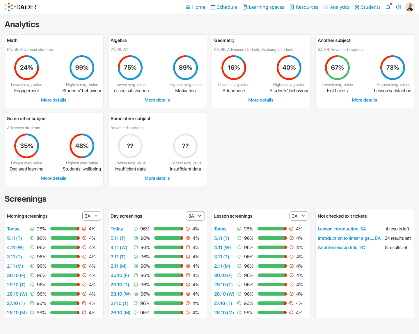
Analytics page, initial version
Impact and outcome
Through ongoing interviews and usability testing, we uncovered evolving teacher needs. A recurring request was for a single, combined metric that summarized overall class wellbeing and practical recommendations for next steps.
To address this, we introduced several new features:
• Data filters to let teachers focus on specific groups or timeframes.
• Historical trend views to track patterns over weeks or months.
• Detailed performance overviews that supported lesson planning and early interventions.
These changes transformed the Analytics Page from a static report into a decision-making tool. Teachers reported that they could more easily identify struggling students, adjust lesson plans proactively, and plan long-term strategies with confidence.
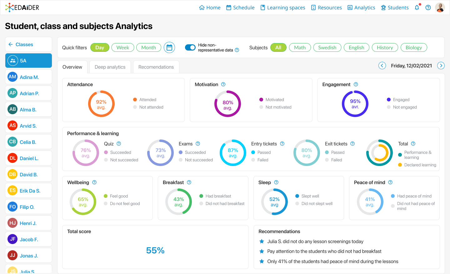
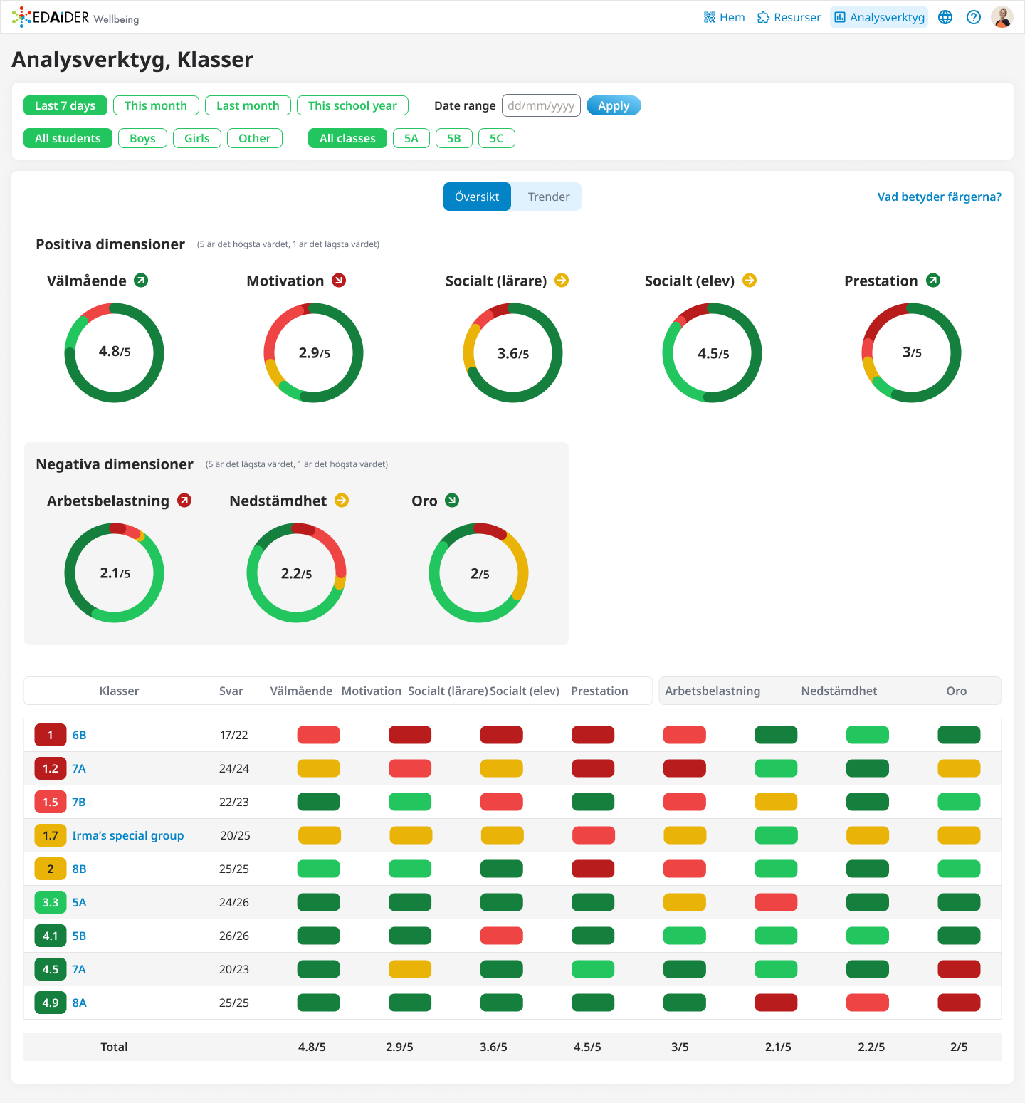
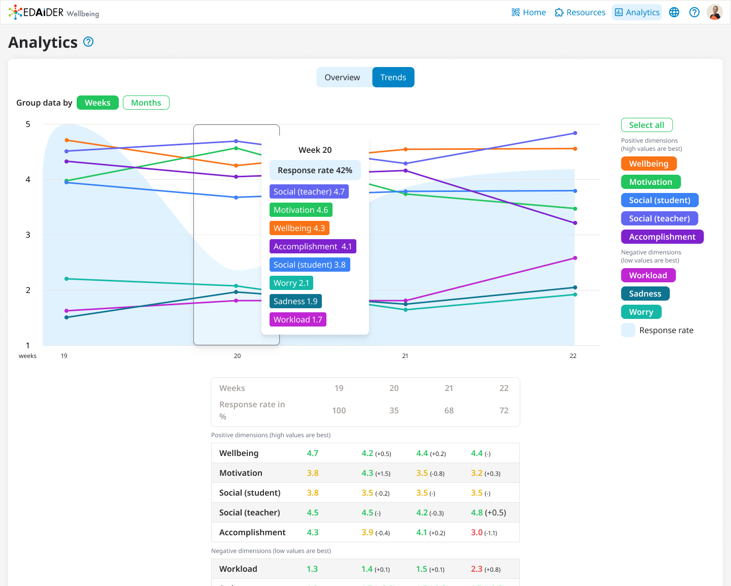
Analytics page, redesigned
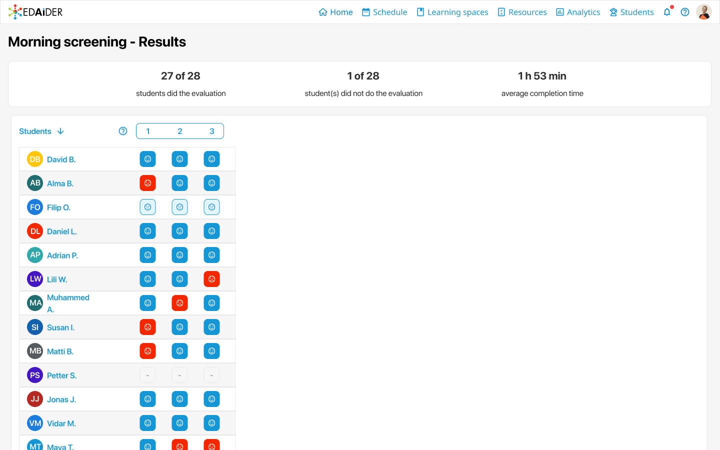
Morning screening data
The Wellbeing app
Building on the success of the Analytics Page, we expanded into a new product: the Wellbeing App, designed specifically for mentors working with small student groups at the gymnasium level. Unlike teachers, mentors needed simpler, more visual insights to guide their weekly 1:1 sessions.
To meet this need, we introduced:
• Color-coded charts to highlight individual student wellbeing at a glance.
• Emoji indicators to make the data more approachable and engaging.
• Sortable tables that helped mentors quickly prioritize which students required follow-up.
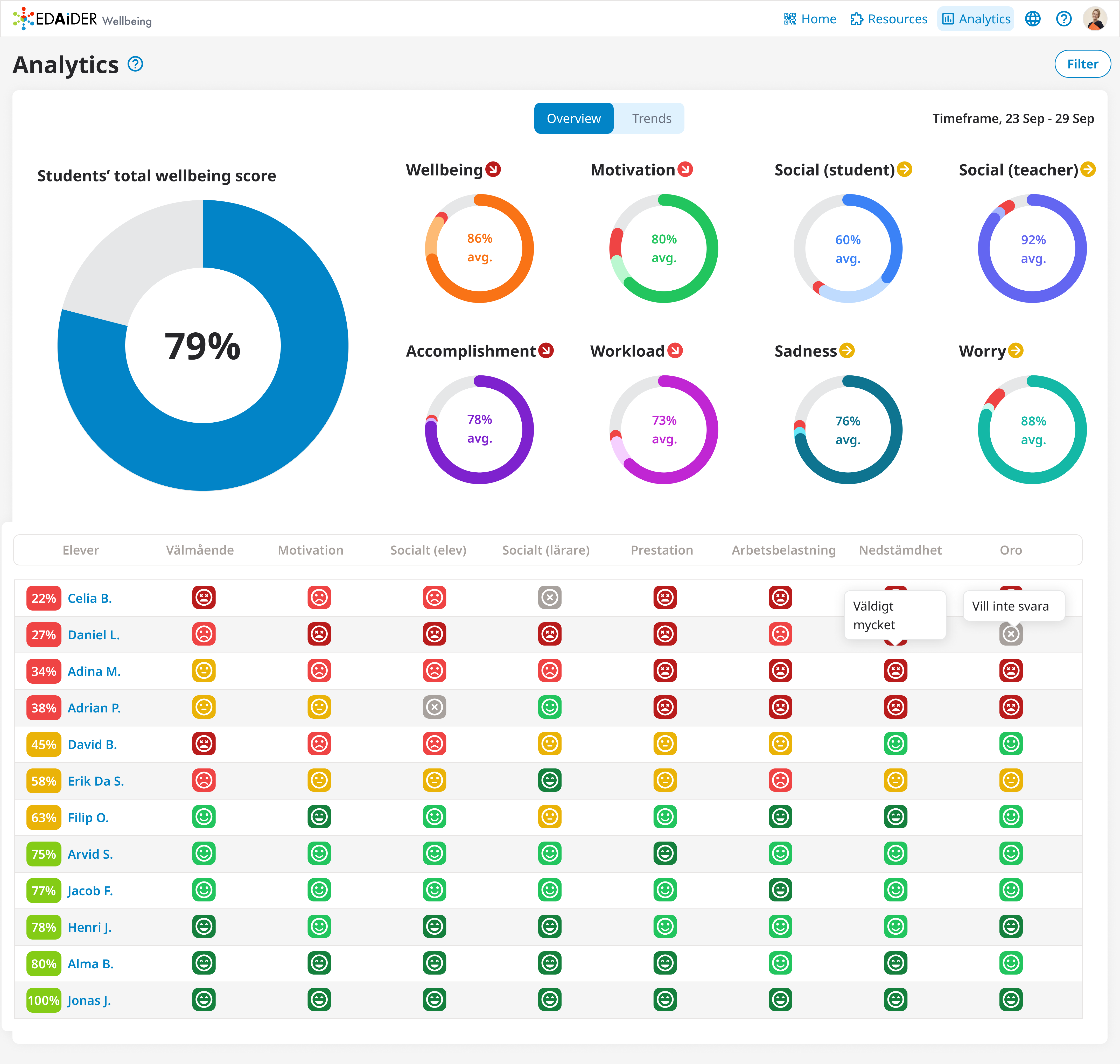
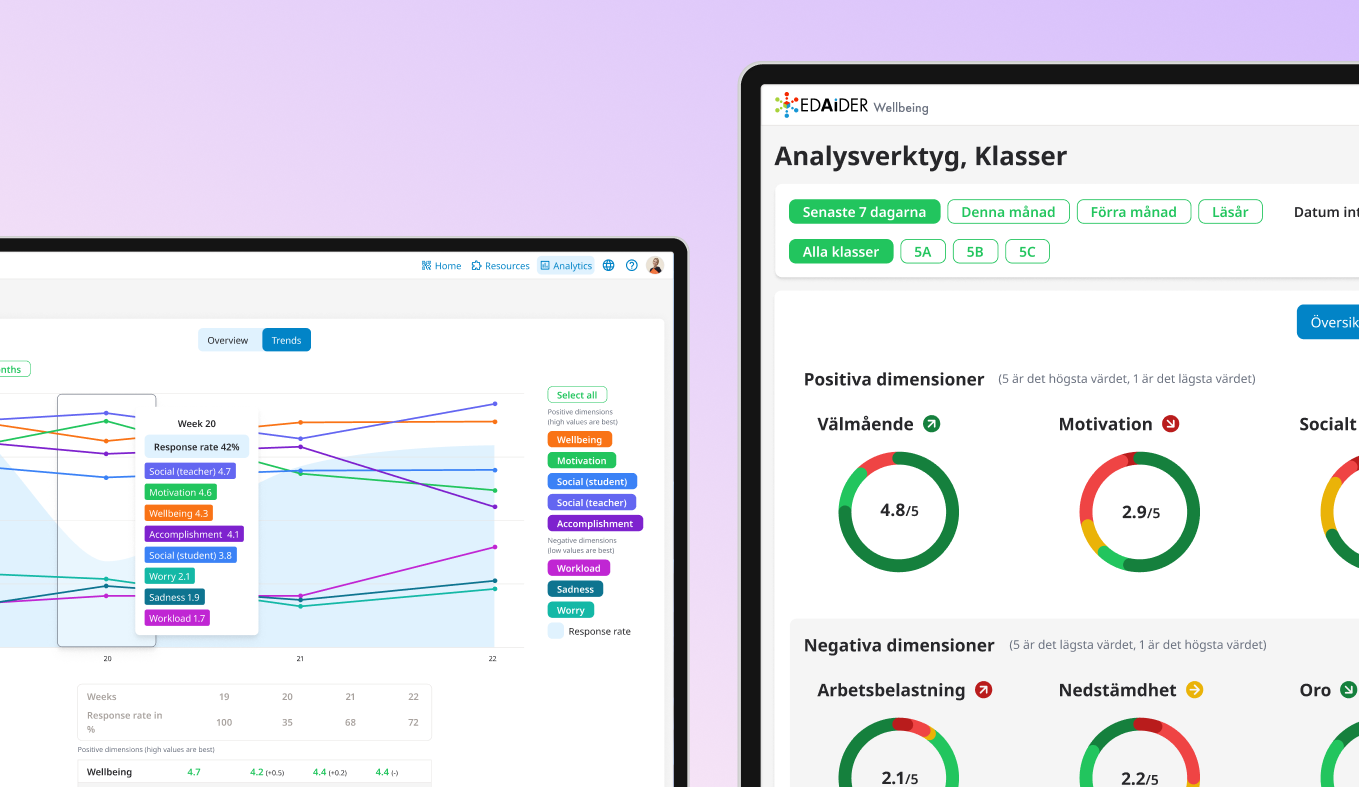
Wellbeing app dashboard, version 1
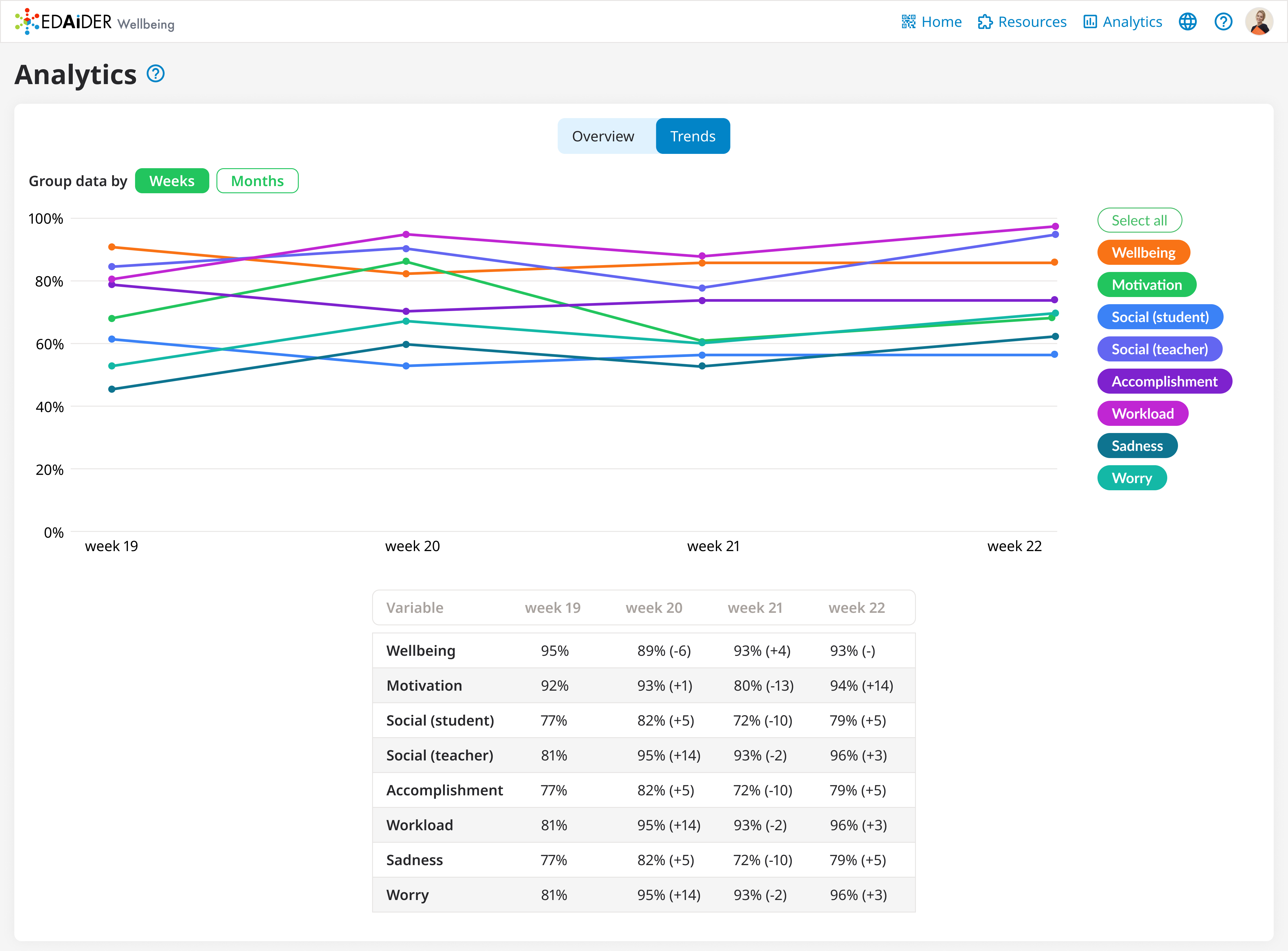
Wellbeing app dashboard with selected Trends tab, version 1
Early testing revealed that while emojis added charm, they also distracted from the core data. Based on feedback, we streamlined the color system (red, yellow, green) for clarity while removing unnecessary visual noise. The result was a cleaner, more focused interface that balanced empathy with usability.
Wellbeing app dashboard, version 2
Wellbeing app, Trends tab, version 2 - new features
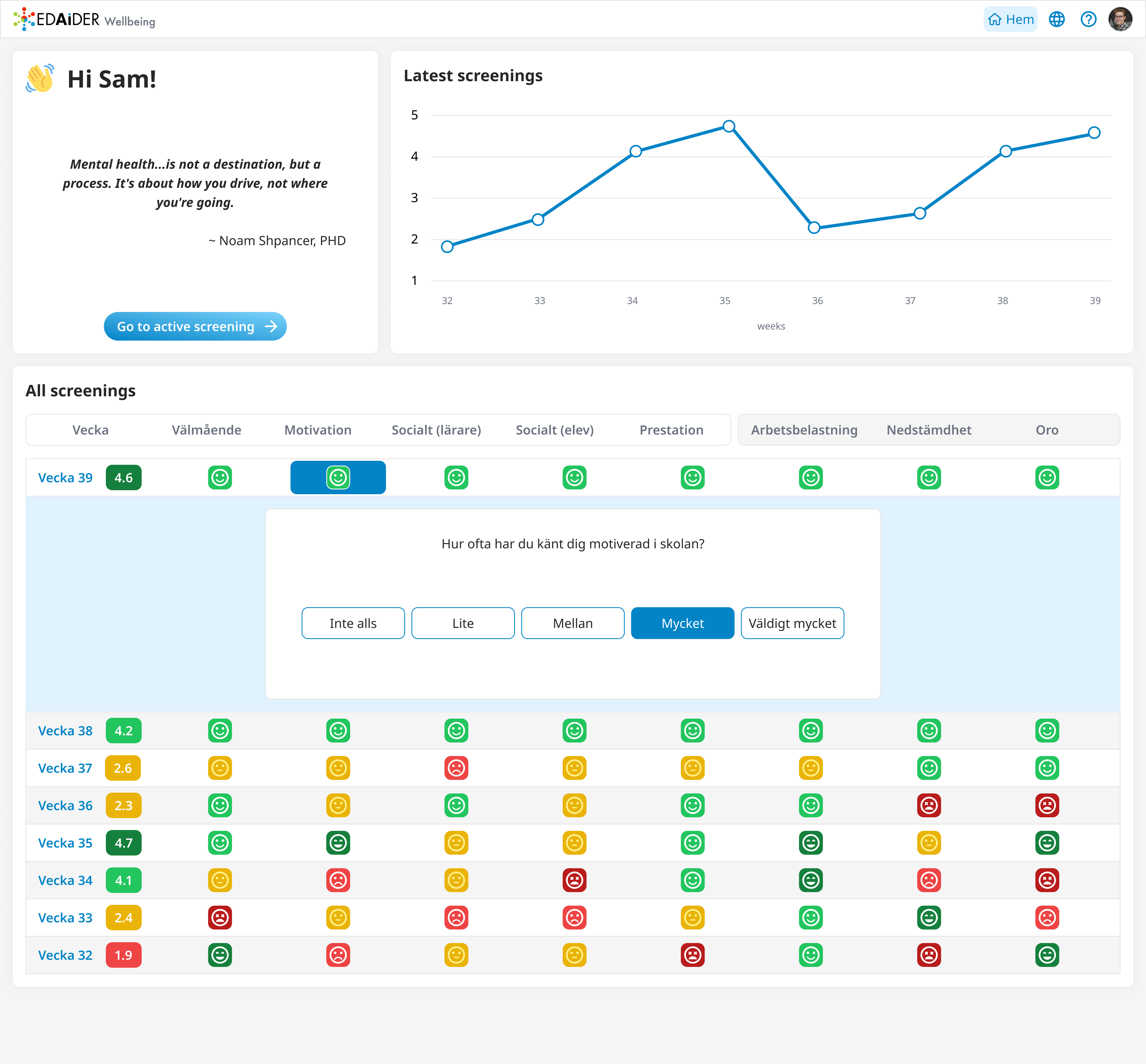
Students could also see their own data and draw conclusions based on it. The emojis were not a problem for them so we decided to keep them.
Although the Wellbeing App was eventually discontinued due to data privacy regulations, the project provided critical lessons in designing for sensitive contexts. It underlined the importance of early research when working with minors, the need to adapt interfaces for different user roles, and the trade-offs between engagement and clarity when visualizing sensitive information.
Lessons learned
This project was a collaborative effort formed by continuous user feedback and cross-functional teamwork. Working alongside designers, developers and a project manager, I interpret teachers' and mentors' insights into actionable design improvements using Figma to prototype and iterate.
Key takeaways from this project included:
• The value of iteration: Regular testing and design reviews helped us refine both functionality and usability in response to real world feedback.
• Designing for sensitivity: Working with student wellbeing data highlighted the importance of clarity, empathy, and careful visual choices when presenting sensitive information.
• Adapting to user roles: Teachers and mentors had distinct needs and adapting the information hierarchy and UI to each group proved essential for adoption.
• The importance of early research: Engaging users early helped us uncover challenges such as data privacy that influenced not only the product design but also the long-term strategy.
Ultimately, this project deepened my ability to design for data clarity, emotional sensitivity and long-term engagement, while reinforcing the impact of user-centered iteration in shaping meaningful digital tools.