Happy Screen
Mobile app concept to help people regulate their screen time (master thesis project)
Project Details
6 months
UX Designer, Researcher
Overview
Happy Screen is a mobile and desktop app concept designed to promote healthier screen habits without harsh restrictions or app blocking. It targets young users who are aware of their excessive screen time and want to reduce it in a supportive, non-intrusive way.
By incorporating machine learning (ML), Happy Screen streamlines setup, adapts to users' habits, and provides gradual tips and suggestions for reducing screen time. This project was the final outcome of my Master's program in Human-Computer Interaction and Social Media at Umeå University.
Process
The project followed an iterative, user-centered approach:
• Competitors research
• User research (surveys and interviews)
• Initial UI sketches
• Prototype v1.0
• User testing (focus groups)
• Prototype v2.0
• User testing (interviews)
Challenge
Excessive screen time contributes to both physical and mental health issues worldwide. While many platforms have started addressing this such as Instagram's “You're all caught up” reminder or YouTube's time watched statistics — existing tools are often limited in effectiveness or frustrating for users.
The challenge was to design a solution that encourages mindful usage without punishment, integrates seamlessly into daily life, and adapts to user habits.
Competitors
I conducted a competitive analysis of 10 screen-time management tools (5 Android, 5 iOS). Key issues included:
• Visual inconsistencies - leading to confusing interfaces
• Inacurate time tracking - reducing the trust in te apps
• Restrictive features like blocking phone calls with limited usability
These insights informed the design principles for Happy Screen: accurate, consistent, and empowering rather than restrictive.
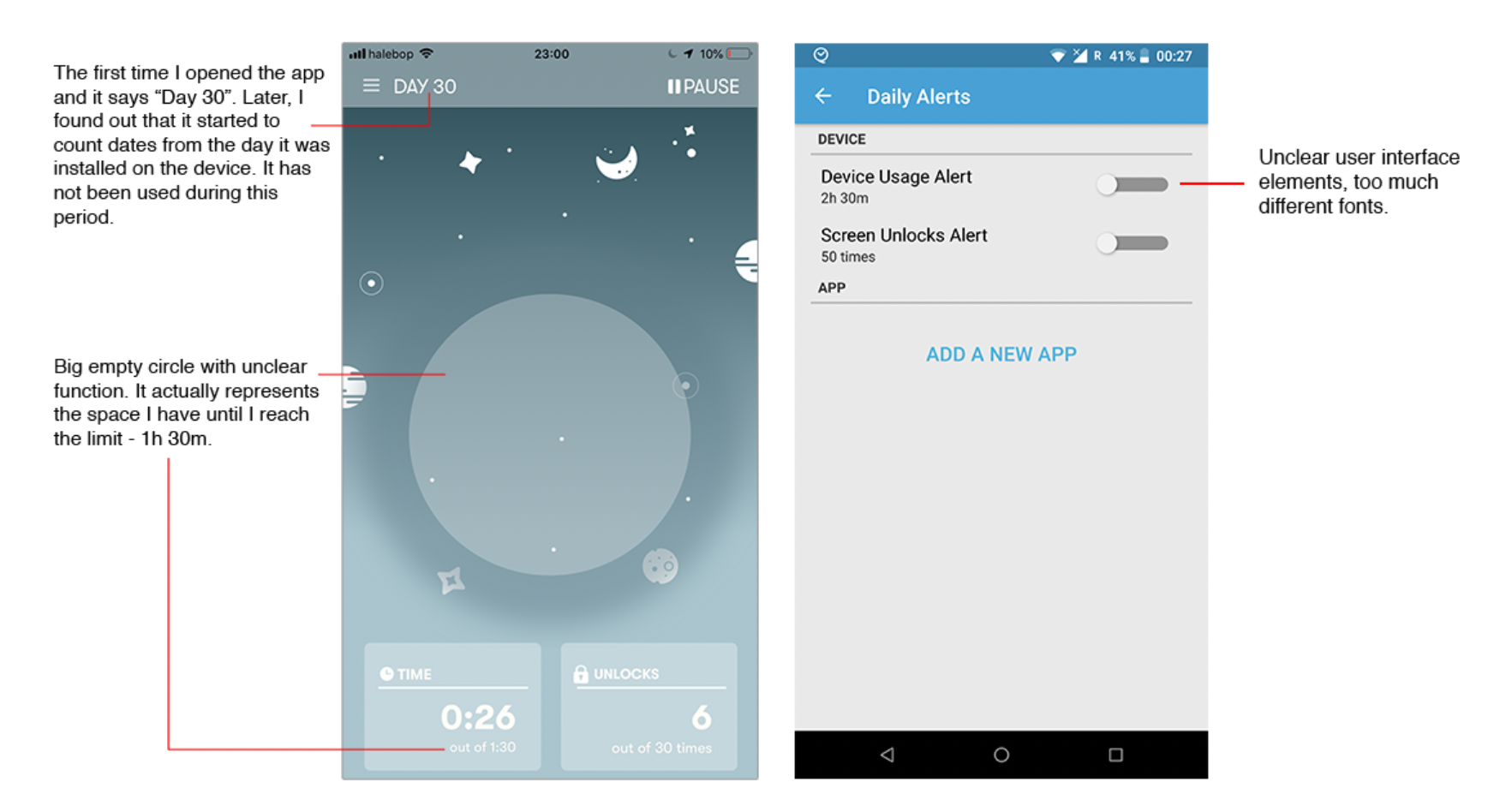
Screenshots from Space and Quality Time (screen time tracking apps) and some of their UI problems
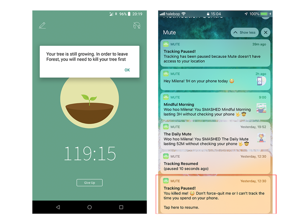
Screenshots from Forest and Mute (screen time tracking apps) and copy issues (usage of the word "kill")
User research
To understand user perspectives, I surveyed 113 participants across age groups and locations. Findings included:
• 52% had never used a screen time app despite being aware of excessive use.
• Many found existing apps too restrictive or inaccurate to be useful.
I complemented this with 13 user interviews (user ages 18 - 32) with people who had used screen-time tools for 1 to 6 months. This helped uncover pain points around usability, setup complexity and workarounds (such as switching devices).
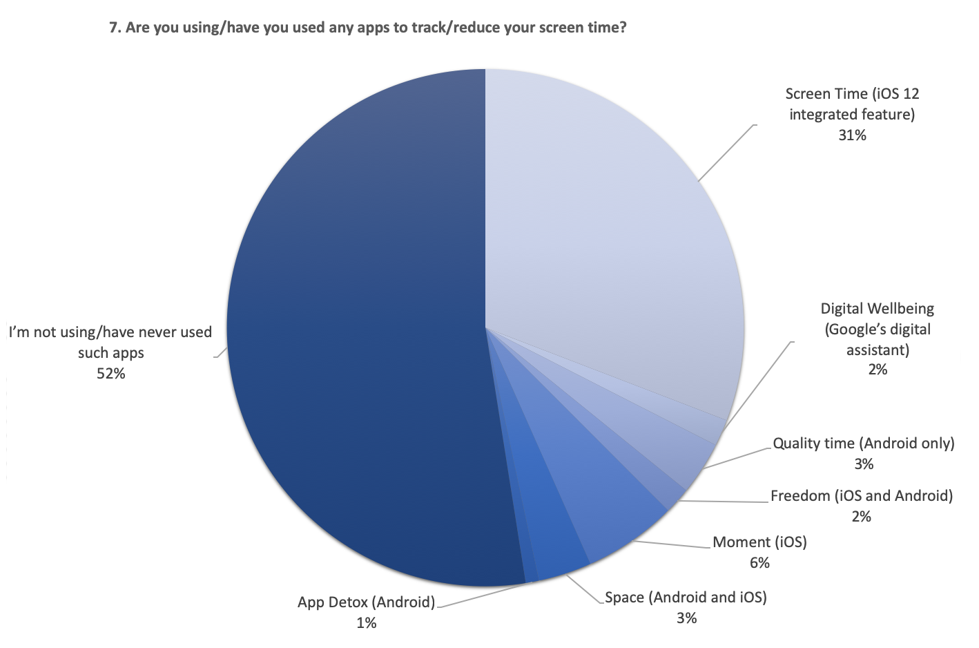
Pie chart with data from one of the questions
Ideation
Based on the research, I developed 4 core design ideas:
1. Machine Learning Integration
• Reduce setup effort by automatically learning user habits.
• Provide personalized tips and flexible suggestions rather than rigid rules.
2. “Alive” Icon / Mascot
• A playful mascot that changes expressions based on usage.
• Visual feedback (smiling vs. crying) to make the experience engaging and relatable.
Different states of the icon/mascot and how it looks like on screen
3. Multi-Device Awareness
• Address the problem of “device hopping” by showing combined screen time across devices.
• Allow ML to suggest reasonable limits, while still giving users freedom to set their own.
4. Gentle Effects Instead of Blocking
• Instead of hard blocking apps, apply progressive “friction” effects:
-- News feeds blur over time.
-- Images gain visual overlays.
-- Certain UI elements become disabled.
-- Allow users a short grace period to finish tasks, reducing frustration.
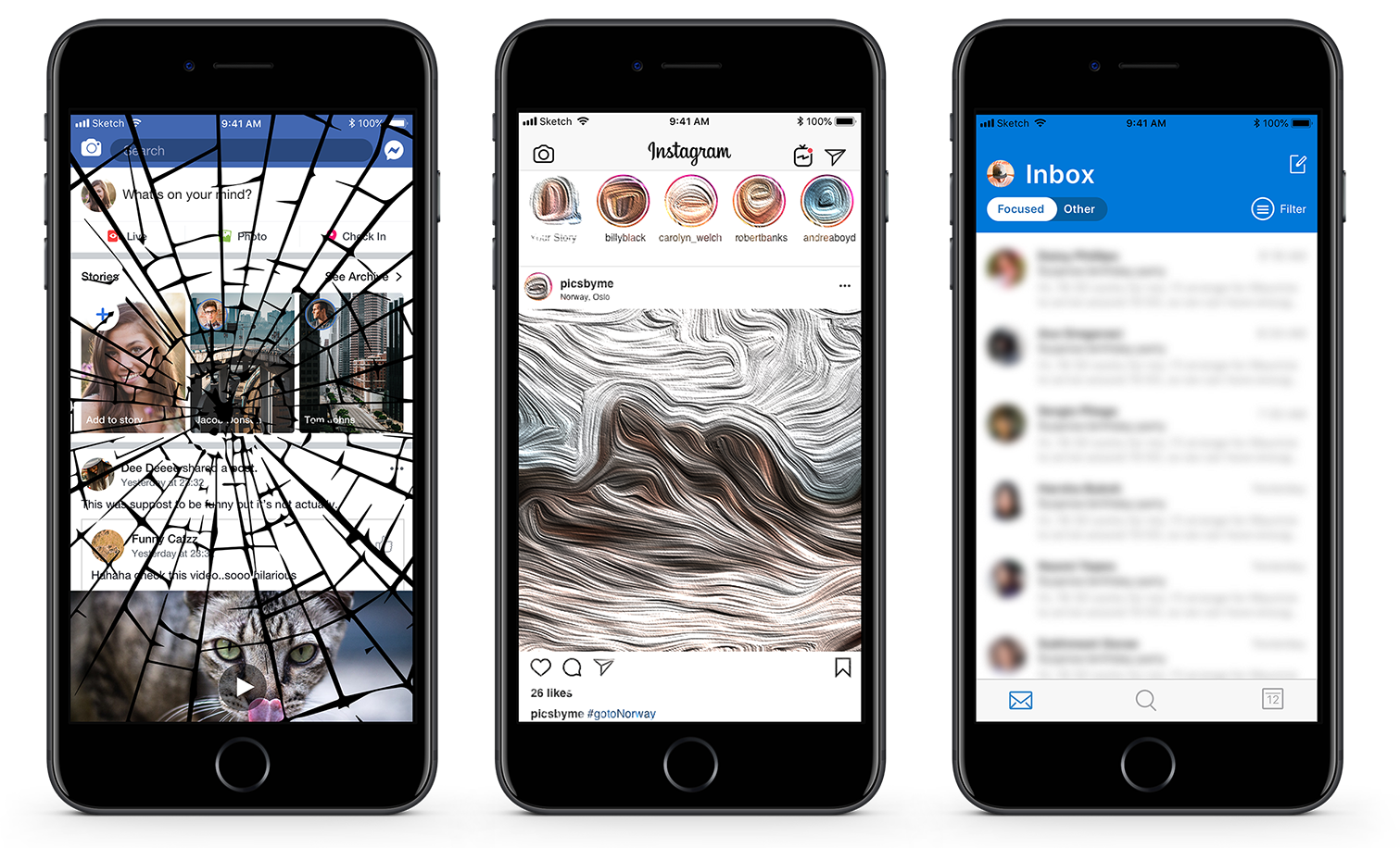
Some of the most popular apps and the "effects" when the screen time limit is reached
Prototyping and testing
For this project I created two high-fidelity prototypes in Sketch:
• Prototype 1.0 - tested with 3 focus groups (3-4 people each)
• Prototype 2.0 - tested via individual interviews with 4 users
User testing validated the mascot concept as engaging, while also confirming the need for flexibility and non-restrictive controls. Feedback directly shaped the second prototype's UI and interactions.
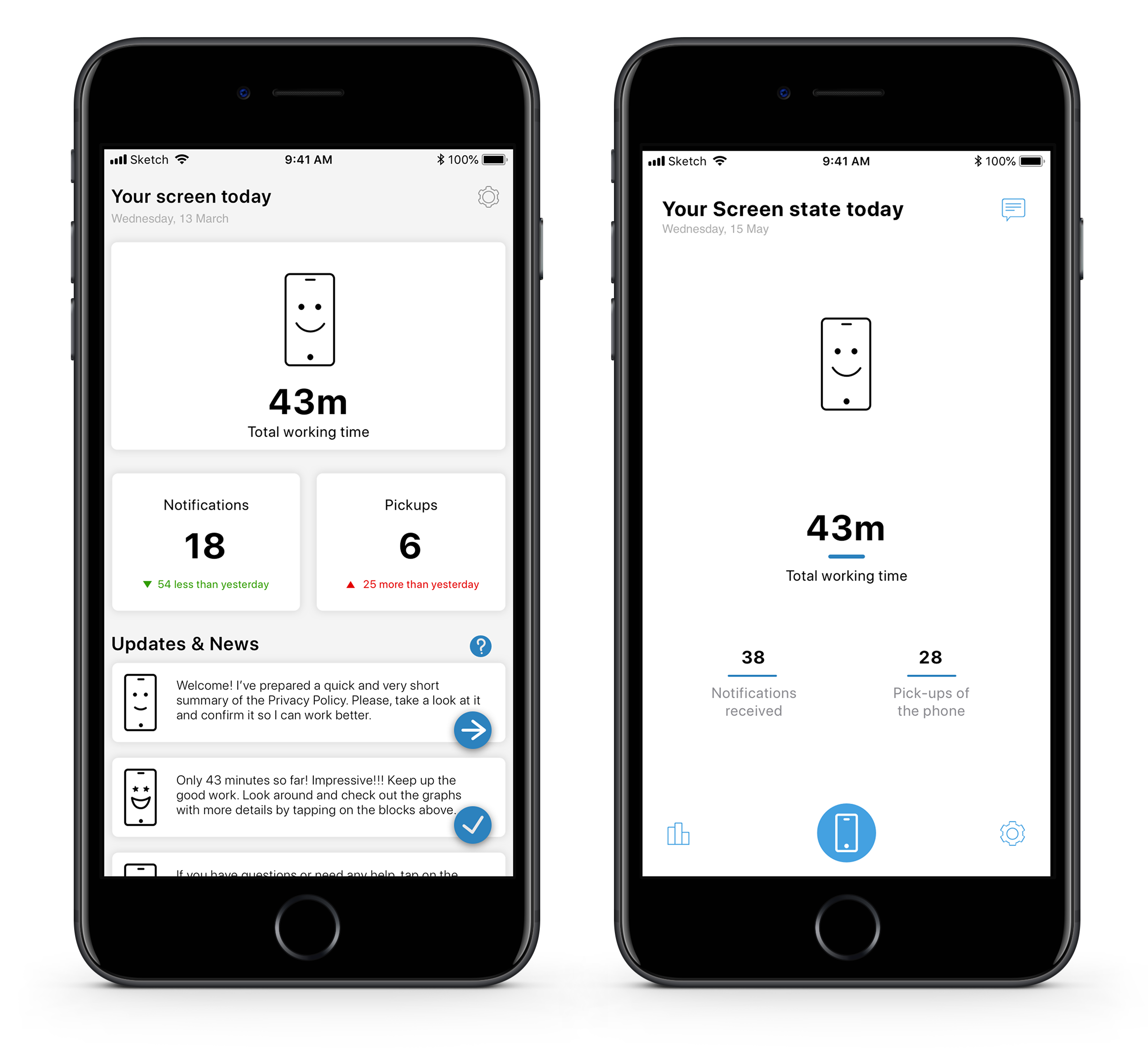
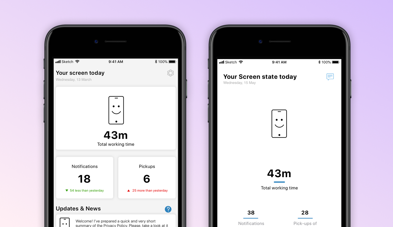
Happy screen's dashboard has been redesigned to make the app clean and minimalistic
Reflections
This project allowed me to explore how technology can promote healthier behaviors without forcing users into rigid systems.
Key learnings included:
• Empowerment over restriction: Users responded better to gradual nudges and flexible controls than to strict app blocking.
• The role of playfulness: The mascot added a layer of emotional connection, making the app feel more like a coach than an enforcer.
• Constraints of research: A short timeline and recruitment challenges limited testing scope, but even small groups provided valuable insights.
I am proud of the final concept, which balances minimalistic design, behavioral insights, and user empathy. If developed, Happy Screen could encourage people to reflect more critically on their digital habits—and ultimately empower healthier long-term choices.