Graphic design, visual design, videos and more
Projects and tasks related to graphic design, visual design and everything in between
Tip
This is a page with a long scroll. Please, use the links on the left to navigate between different projects.
Printed and digital materials for EdAider
As part of my work at EdAider, I designed several printed materials to support the marketing and communication efforts. These included one pagers, exhibition wall designs, water bottle labels, rollups, t-shirts and more. The designs were mockeup up in Figma and the final printable files in Adobe Illustrator and Photoshop. All designs follow the company's brand guidelines and visual identity. The goal was to create professional and appealing materials that would attract potential customers and partners. And I can proudly say that the materials were well received and used in various events and fairs.
The first rollup I designed for EdAider and the first water bottle labels at SETT 2022. I didn't have time for versions back then. We decided to participate quite late, so these designs are very basic.
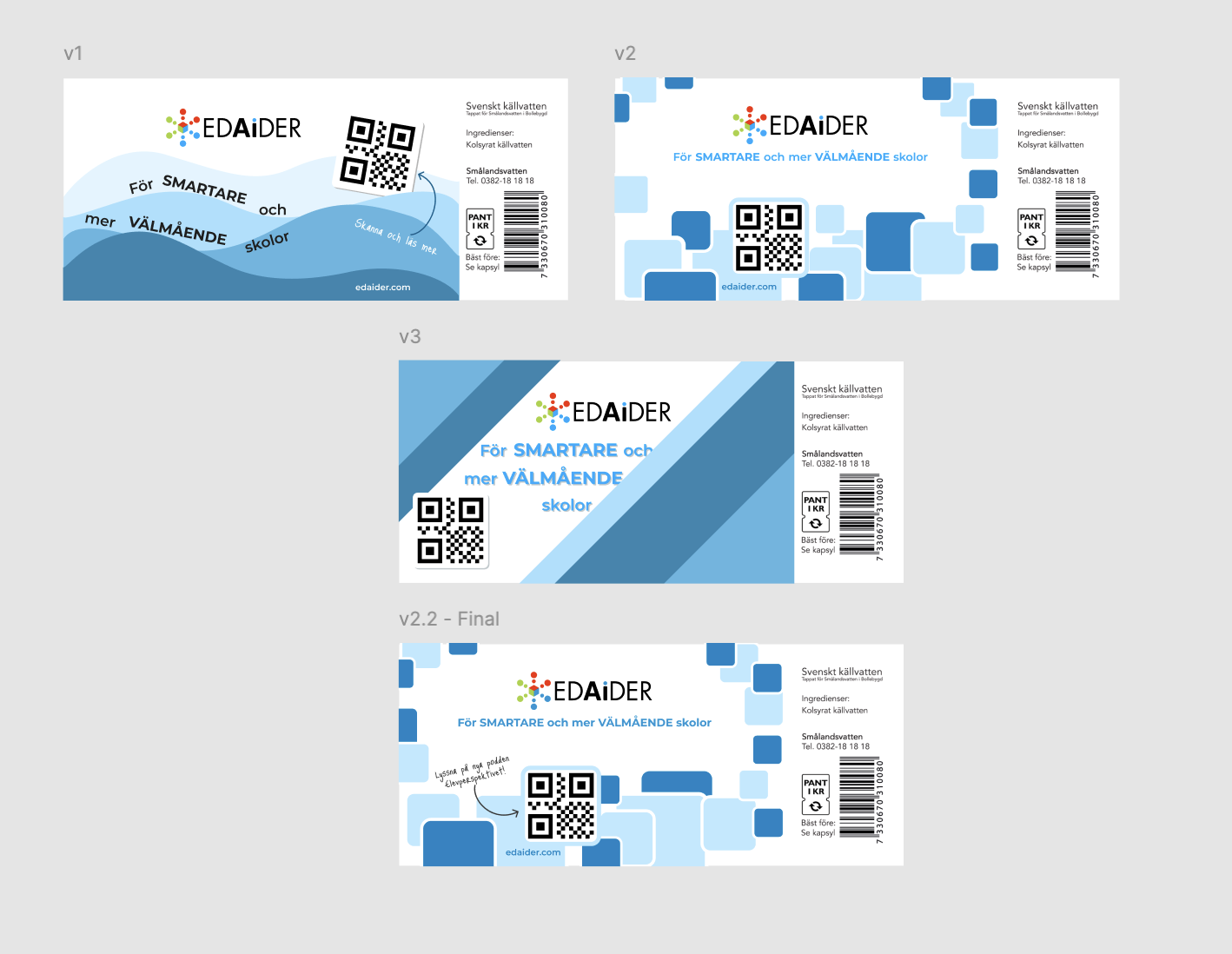
Concepts and final design for water bottle labels. The labels were printed and used in at SETT 2023 fair. There is definitely an improvement compared to the previous year's designs.
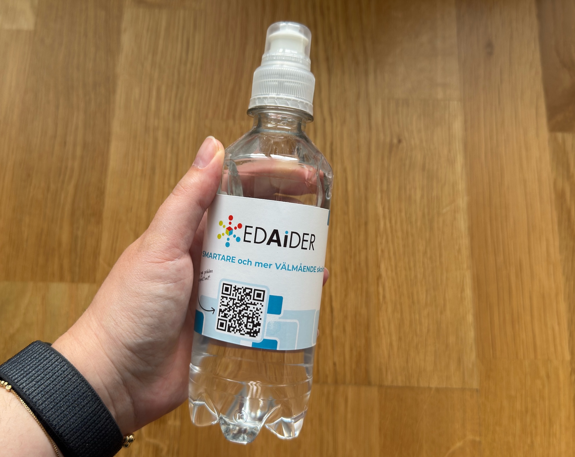
One of the water bottles with the label that I saved as a memory. Looking at it now I realize that the title is not readable and the bottle needs to be rotated. But still, it's a way to learn and improve.
For SETT 2023 I had more time to prepare the materials. This is how the EdAider space looked like. I designed the wall, the rollups, the water bottles, and the video on the screen.
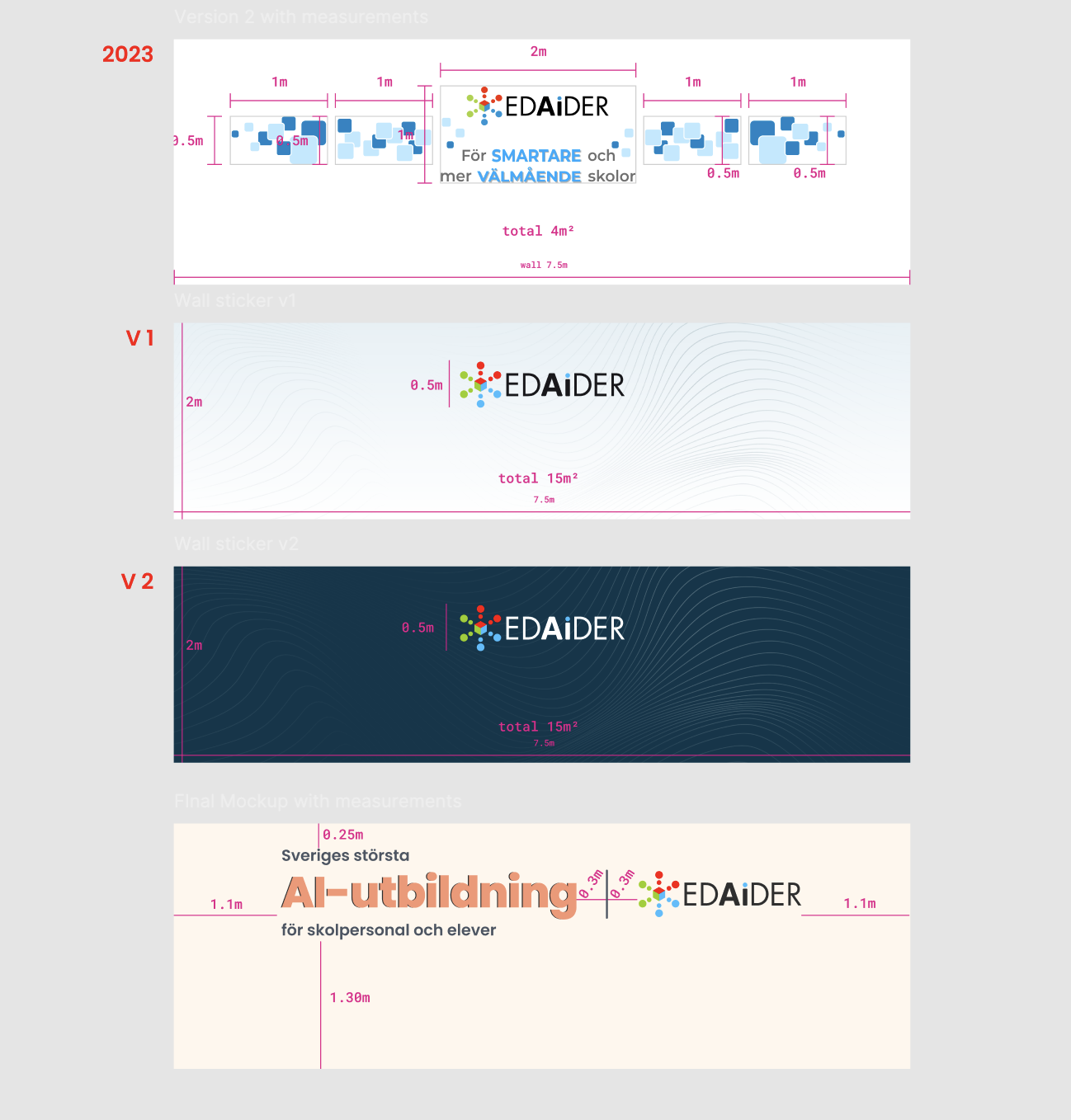
The following year I was asked to use elements from our new (at the time) website design. I created several suggestions and at the end we went with a version promoting the new product - AI course. The wavy lines would increase the costs for printing so we decided to remove them.
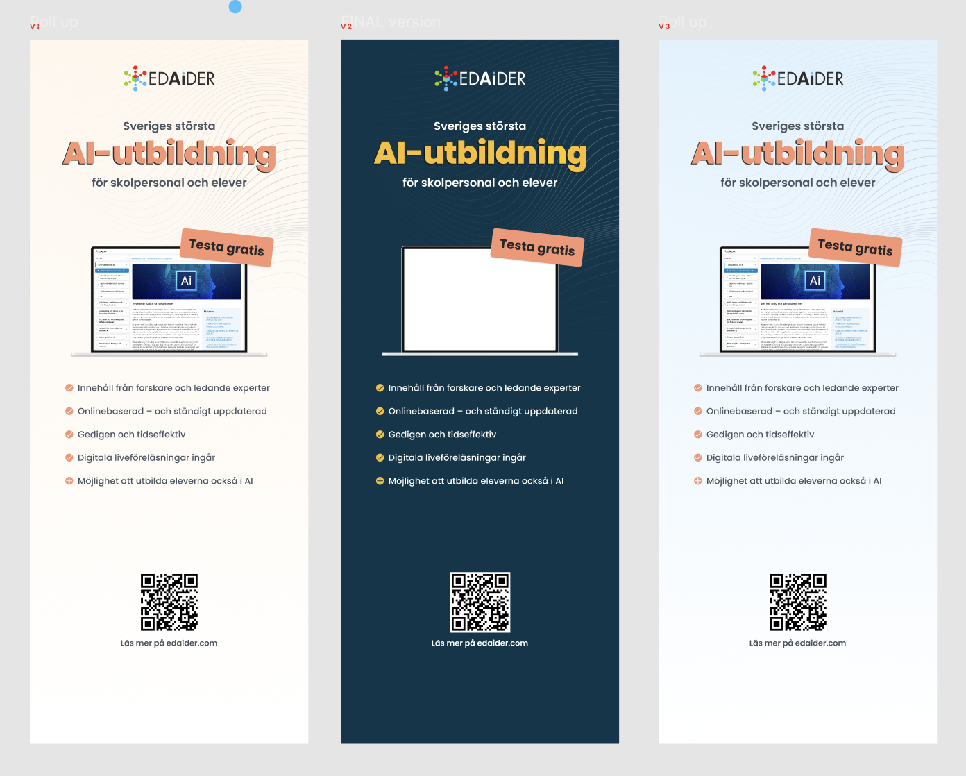
Rollup concepts for SETT 2024. I created several versions and at the end we went with the darker one. It looks very good in the environment with the light wall design (see next photo).
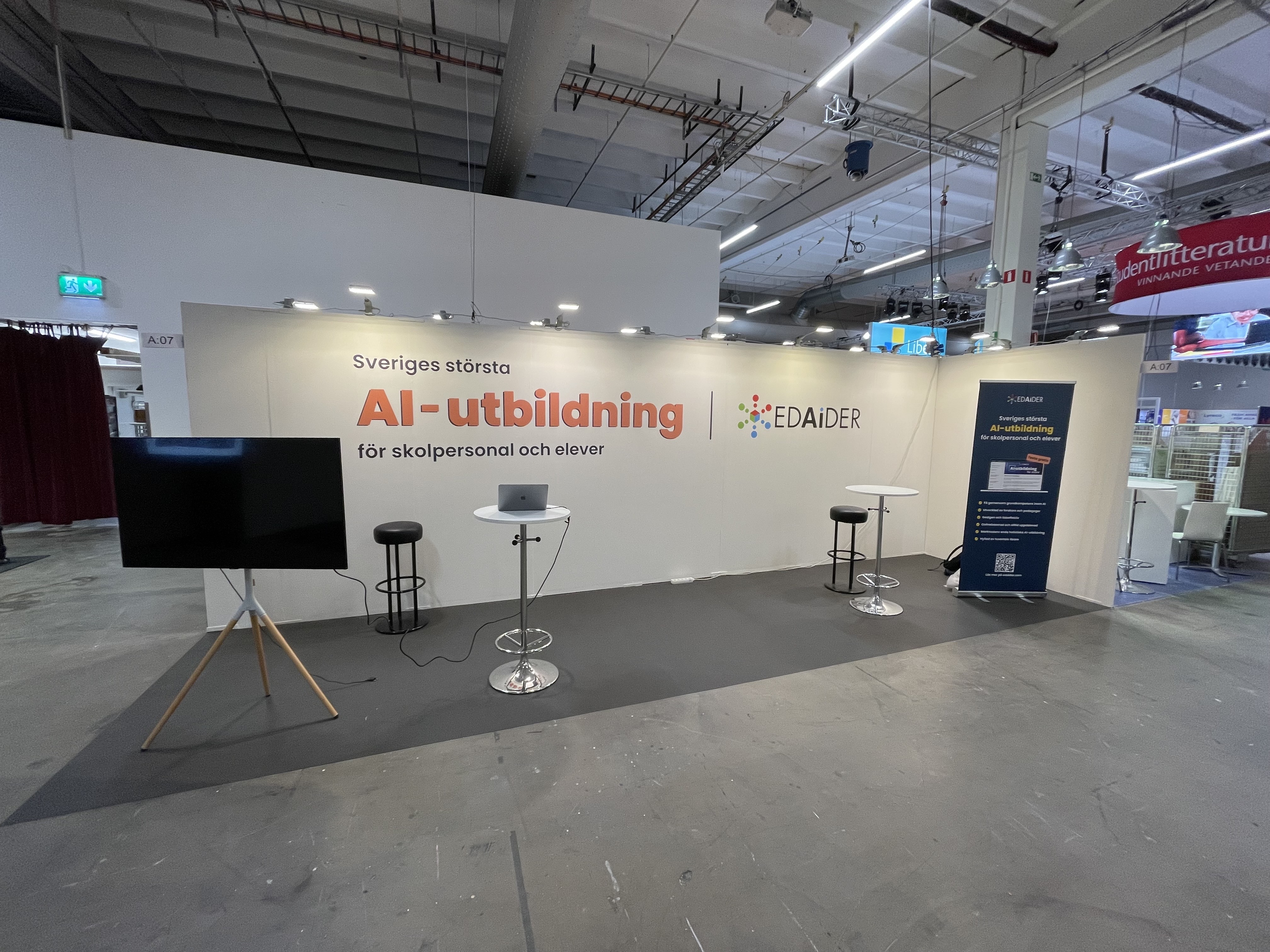
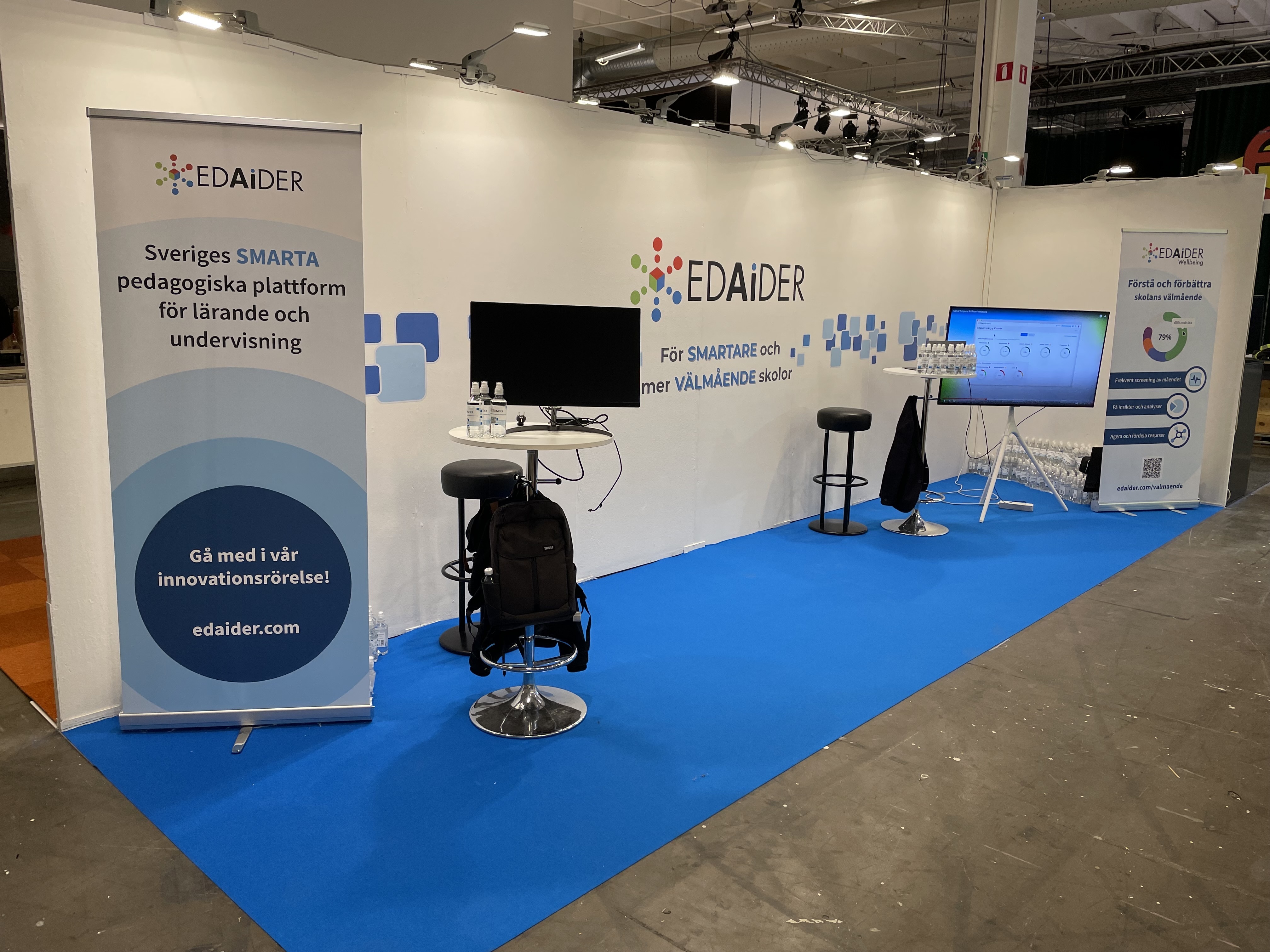
We booked the same space for SETT 2024 and this is how it looked like. The wall design, rollup and the video played on the screen were all designed by me.
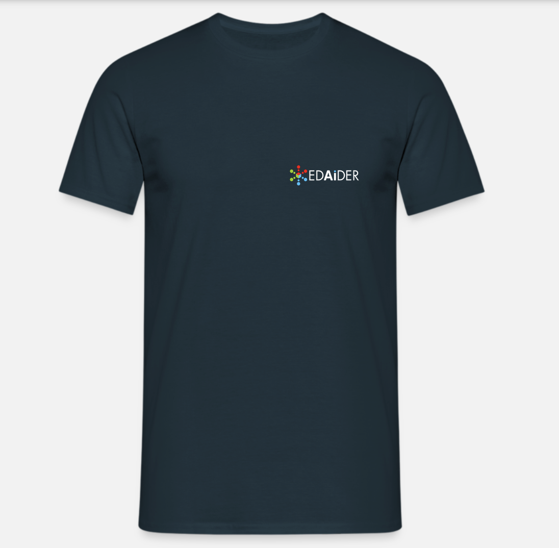
Inspired by other companies at the fair, I designed t-shirts for the EdAider team to wear during the event. The design is very simple - just the logo on the front. It was easier to differentiate the team members from the visitors.
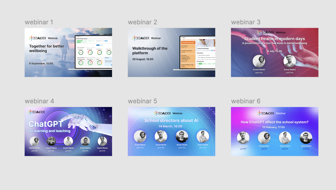
We were hosting webinars on a regular basis and I designed the images used to promote them. I had the freedom to experiment with different styles and colors.
Videos for EdAider
During my time at EdAider I also created several videos to promote the company's products and services. The videos were used on social media, website and during events. I used DaVinci Resolve for video editing. The videos are simple and short and they serve their purpose well. If you're interested, you can check out the videos on EdAider's YouTube channel - all created by me.
This is one of the first videos I created for EdAider. Animating the 3D screne was a great learning experience for me.
Know-How/Show-How - Design Thinking Summer School Project
I took part in a summer school for creative thinking and design processes called Know-How/Show-How. The program took place in Sofia, Bulgaria. During the program I worked on a project where we created a dingbat font from fences elements in urban environment. We photographed different types of fences and then used the images to create a font. The project was a lot of fun and I learned a lot about typography, font creation and design processes. For more information, images and results, check out the Behance project below.
Behance project part of Know-How/Show-How - Summer School for Creative Thinking and Design Processes
Rollup designs for Bruised Food Club
Bruised Food Club is a non-profit organization that collects and redistributes surplus food to people in need. I designed two rollups for them to use at events and markets. The designs are simple, colorful and eye-catching, with a clear message about their mission and values. I created the initial design suggestions in Figma and then adapted the files for printing in Adobe Illustrator.
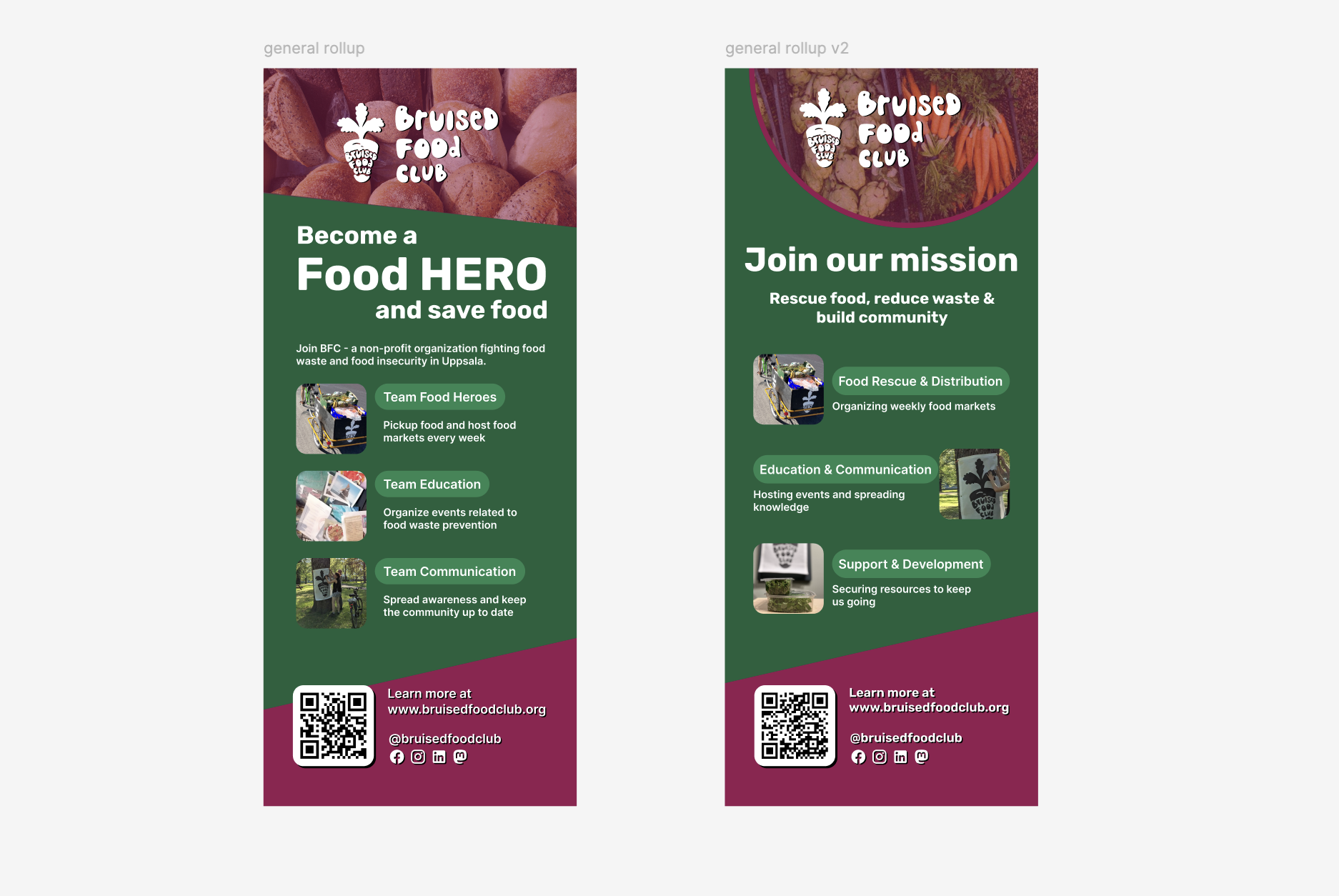
Rollup designs for Bruised Food Club
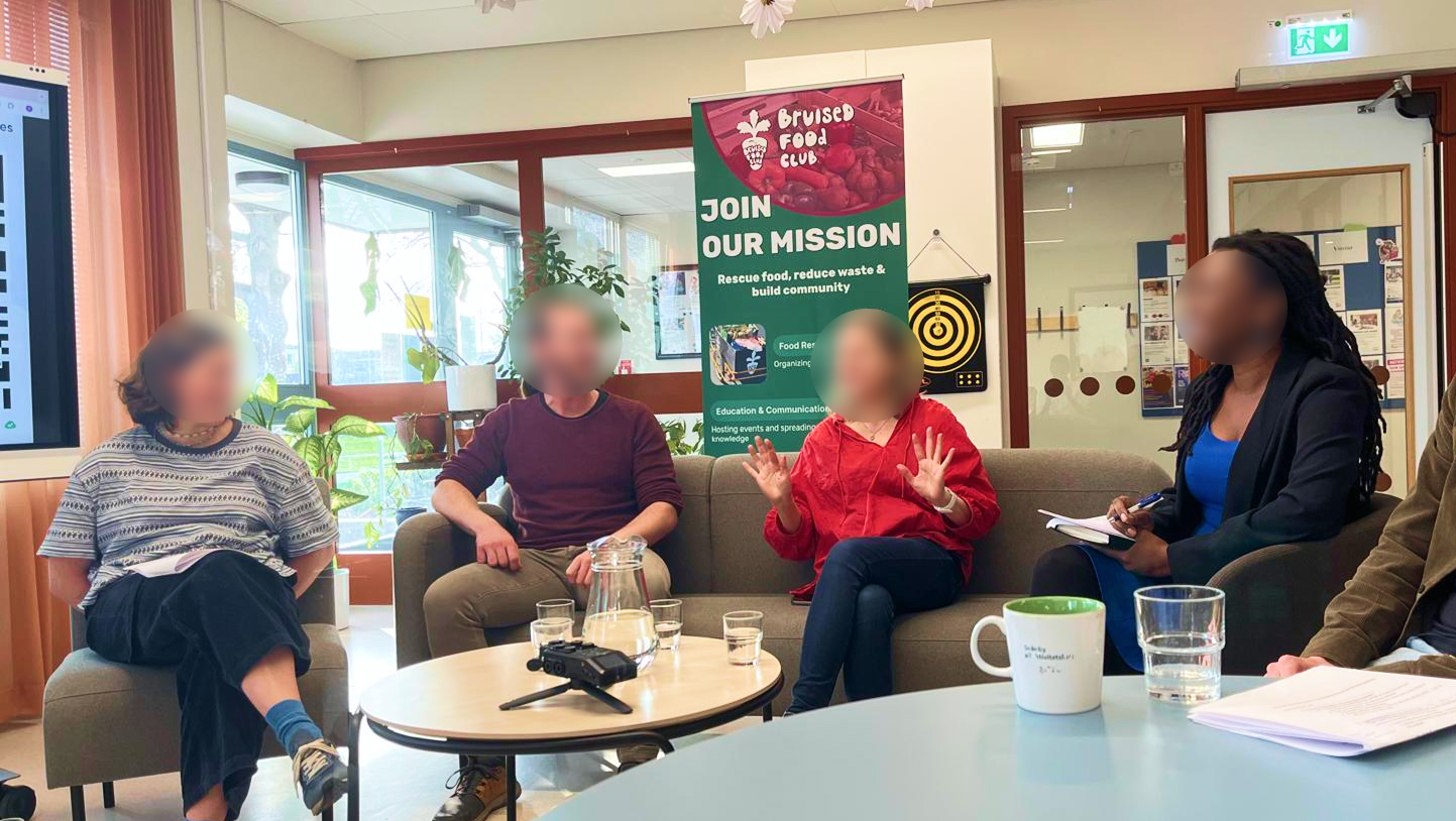
Rollup design in use during a meeting
Branding and Web design for Umeå Wheels
Umeå Wheels is a small company started in Umeå that sells and rents bicycles to students. I designed a logo, business cards, t-shirts and website for them. The style is simple, minimalistic and modern, with a touch of playfulness.
Some of the logo explorations
The logo is inspired by the shape of a bicycle wheel and the letter U.
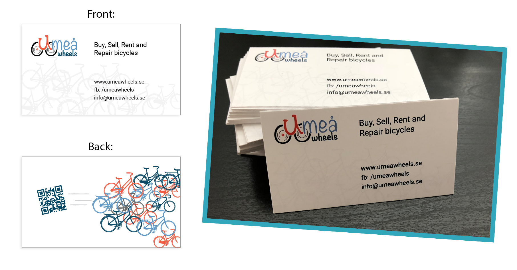
Business cards designa and printed
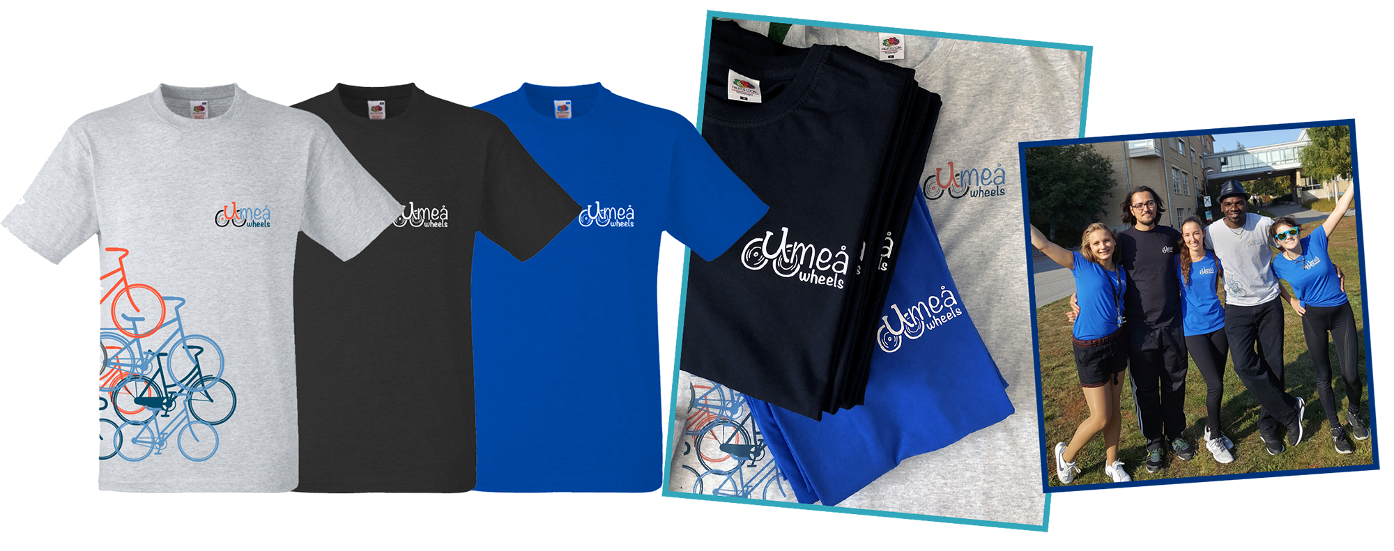
T-shirts design and members wearing them
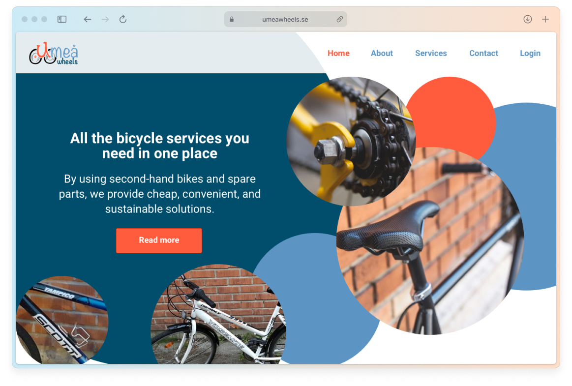
Hero section of the website
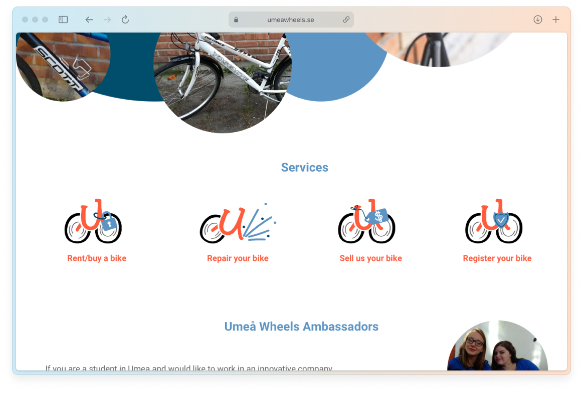
Custom icons for the Services section
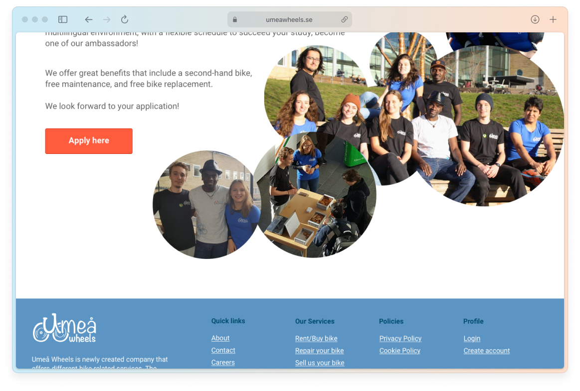
Become a member section