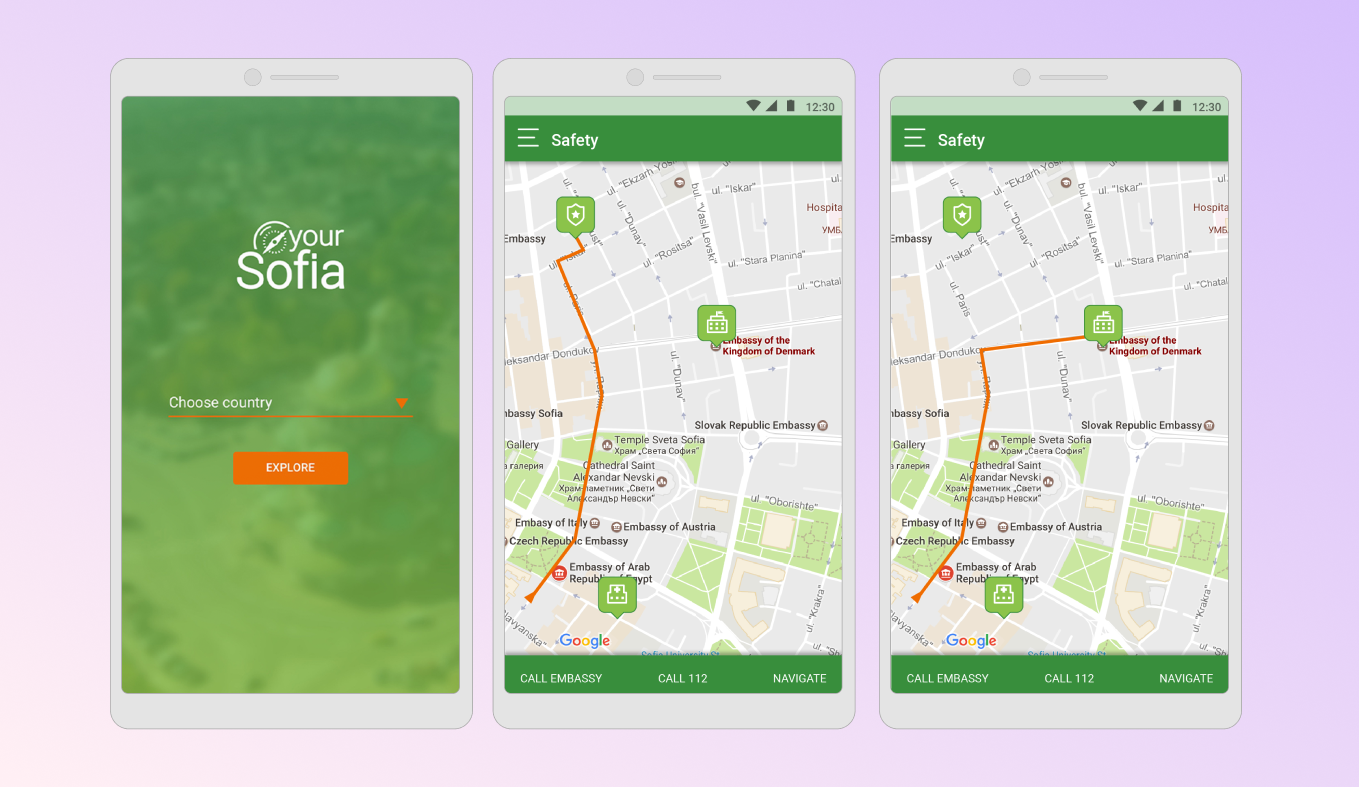
Your Sofia
UX/UI design for a mobile app to help turists and visitors find activities and places to visit
April - May 2017

Overview
Your Sofia is a mobile app designed as a digital tour guide for visitors to Sofia. It offers information on popular sightseeing spots, guided tours, and events. Users can create personalized routes by selecting multiple places of interest, and choose their preferred mode of transportation. The app provides navigation and notifies users of places along the way.
My role and tasks
Role: UX designer with stong focus on UI
Tasks:
- Create easy-to-use and friendly UI for the Android devices and the following screens:
- Starting screen
- Map with a route
- Search results with sights and landmarks
- Creating a route
- Route “in progress”
- Add custom-created icons to enhance the UX
User flow
The client provided the following rough sketch:

To present the app’s features clearly and keep my work organised, I developed a user flow chart that includes all the required functionalities.

Custom icons
Originally designing icons was not a requirement but I found an opportunity to practice my skills and it was fun. This is the final set:
![]()
Key features
Before starting, users are prompted to choose their country of origin, which saves their information for emergencies and provides access to their embassy’s location and contact details. Additionally, the app offers information about the nearest police station and a quick call button for emergencies (112).

The app’s main feature is creating a personalized “route” for sightseeing. Users can select places based on their interests, and the app presents them as cards with additional details like average visit duration and entry fees (if applicable).


Once the route begins, users view a map with all the selected places, along with the distance and estimated time to each location, based on their chosen mode of transportation. Users have the flexibility to pause and resume the route, as it is automatically saved within the app for future use.

Here is a LINK to the prototype.
Takeaways
This project provided me with experience in improving my UI skills. During the time I had several ideas to enhance the UX through innovative features. Given more time for research and real user testing, the app could have reached its full potential, but unfortunately, it was not part of the scope.
