Bruised Food Club
Web design, UX strategy and content restructure for non-profit organization
Project Details
2023 - ongoing
Web designer and developer
Overview
Bruised Food Club is a non-profit from Uppsala that collects and redistributes surplus food on a weekly donation-based markets. Their team needed a refreshed website that clearly communicates their mission, engages supporters, and fits within strict technical and budget limitations.
My role
I redesigned their WordPress.com website, improving the user experience and visual design to better reflect the organization's values. I continue to manage and maintain the site today - BruisedFoodClub.org.
Limitations
The project came with significant technical and financial constraintss:
• The team already had a WordPress.com subscription and did not want to upgrade.
• Custom code, premium themes, or paid plugins were not possible due to budget limitations.
This meant the redesign had to be executed entirely within the native drag-and-drop WordPress.com builder, requiring careful adaptation of the design to the platform's restrictions.
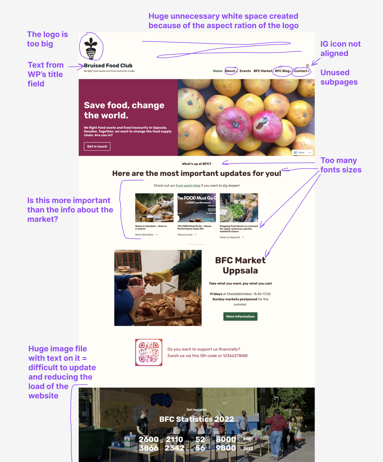
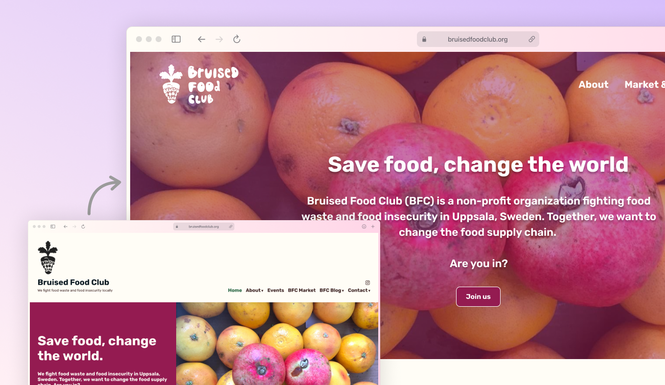
This is how the front page of the website looked like with my notes on it
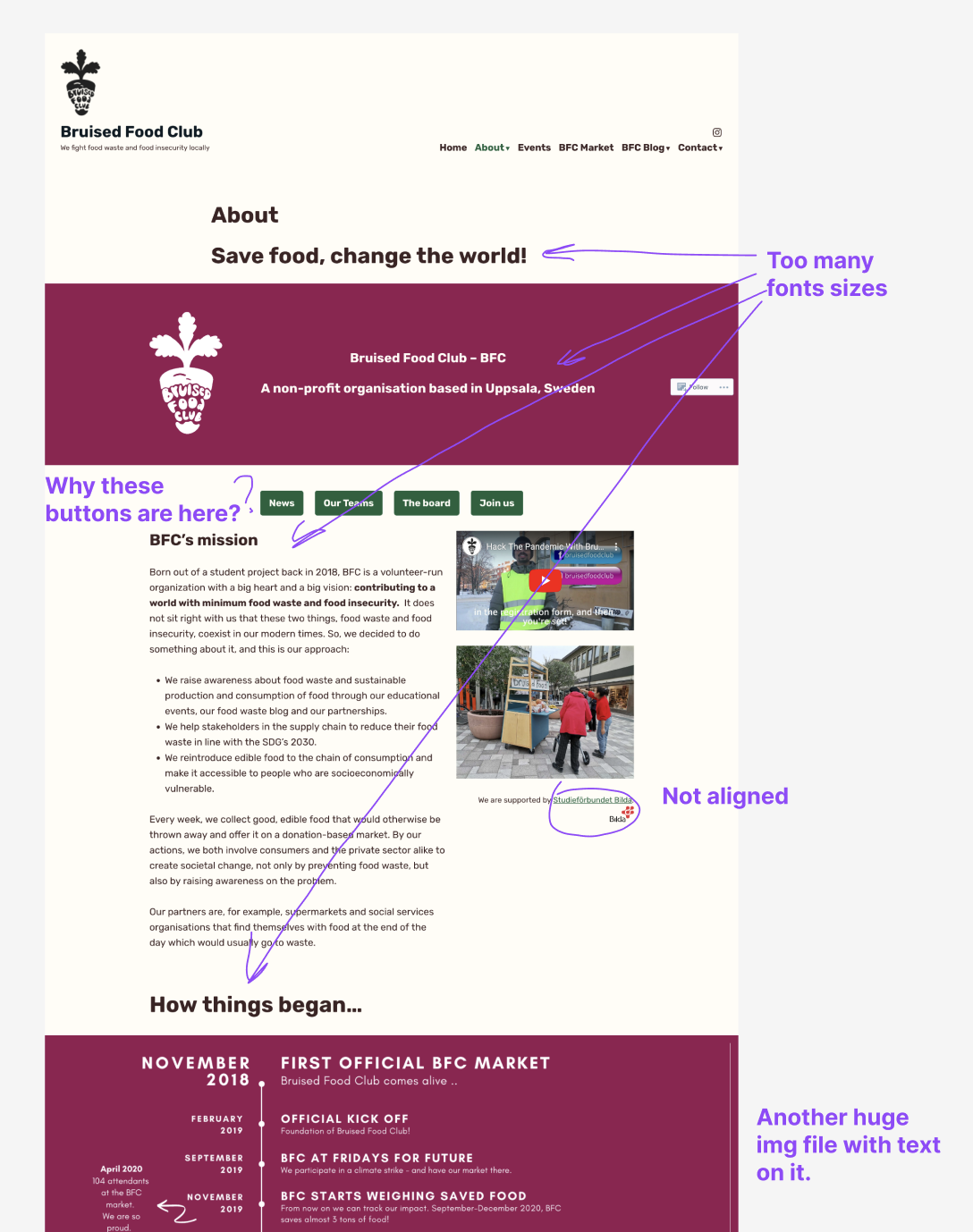
About page with my notes on it
Some of the problems
• The vertical logo made the header and main navigation take up too much screen space.
• The Instagram icon was visually misaligned with the navigation links.
• The navigation contained multiple dropdowns leading to overlapping and redundant pages.
• Content was scattered and unclear, making it harder for visitors to understand the organization's mission.
What I did
To better understand the existing structure, I took screenshots of all pages and mapped the site architecture in Figma, including navigation paths and links. This revealed where content overlapped and where the clarity could be improved.
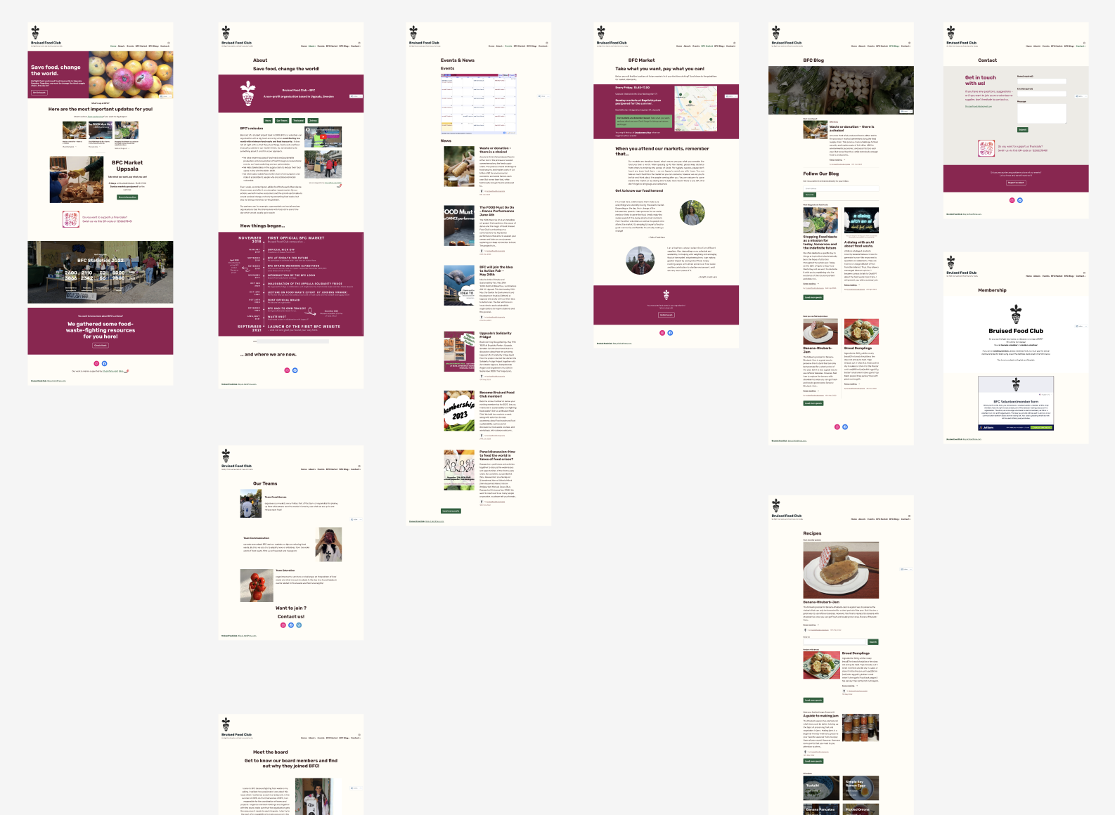
Screenshots of all existing pages
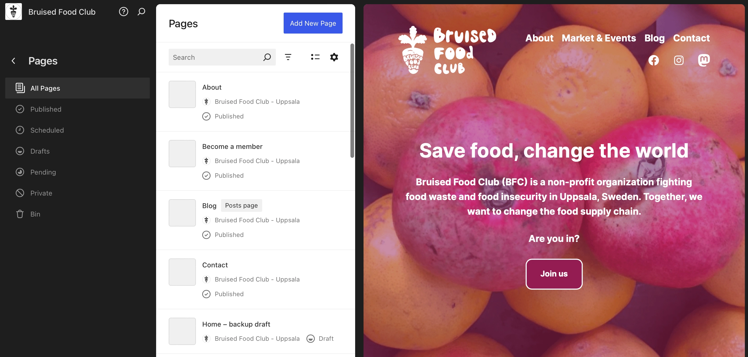
Removing and combining pages
I reviewed all of the information and merged the related content. For example, instead of having different pages with a few lines of text about the organisation, the teams and the board members, I created one common page About Us. This reduced the links and the dropdown in the main navigation, simplified the navigation and made the information easier to find.
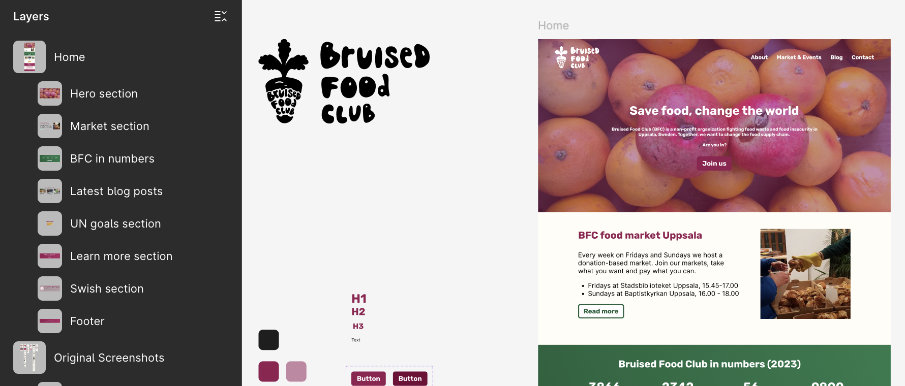
Figma design (Home page)
The redesign of the homepage focused on clarity and storytelling:
• Hero section: Used the existing background image full-width, overlaid with a title and prominent CTA button.
• Weekly markets section: Placed prominently near the top to highlight the organization's core activity.
• Impact numbers: Added as a visual break and credibility builder.
• Blog posts: Repositioned further down to give more visibility to the weekly markets.
• Sustainability goals: Added a section showing how BFC contributes to the UN goals, supporting their mission-driven impact.
• Call to action: Included a donation block with a QR code and clear instructions on how to support BFC.
This structure improved storytelling and aligned the page flow with user priorities.
Screenshots of partial Figma UI and design
Wordpress design
Due to the restrictions of the WordPress.com subscription, the Figma design could not be translated pixel-for-pixel. Instead, I rebuilt the design using only the available drag-and-drop components. This required creative problem solving and iteration to adjust the design within the platform's limits.
Part of the home page design in Wordpress and the pages' structure
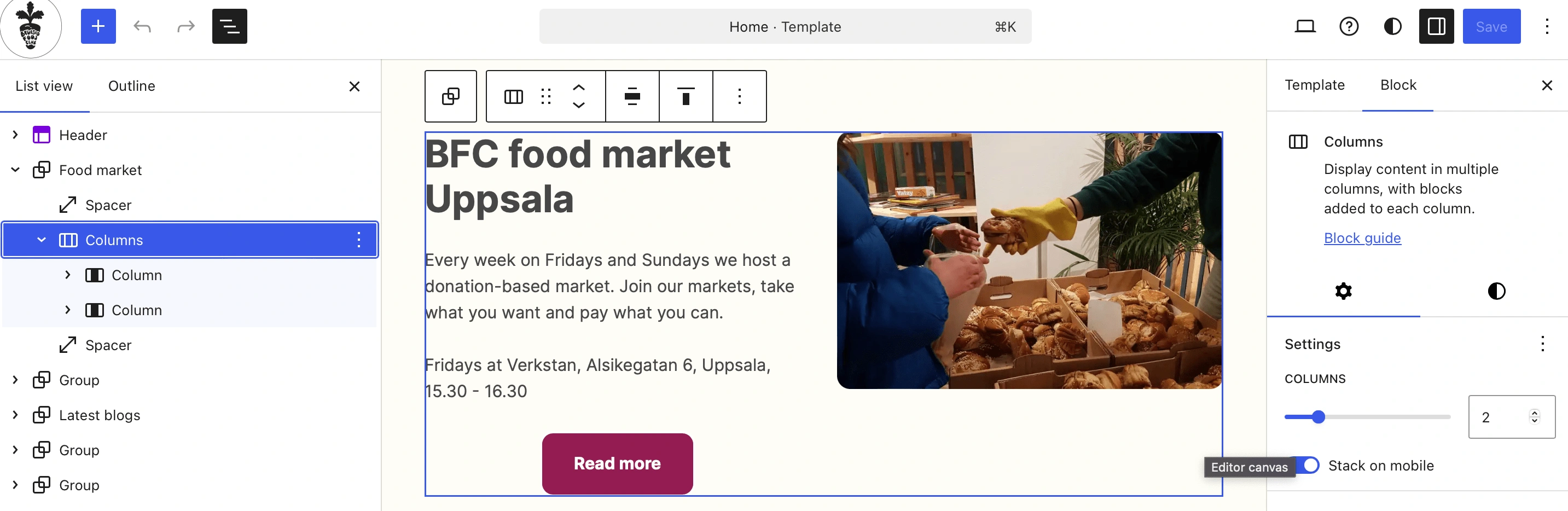
Replicating a design in Wordpress builder is time-consuming
Final thoughts
Redesigning under strict platform and budget constraints was a challenge that strengthened my adaptability as a designer. Without access to custom CSS or advanced theme controls, I had to think creatively about how to achieve the desired visual outcome with limited tools.
Key takeaways:
• Constraints drive creativity: Working without custom code forced me to prioritize clarity, hierarchy and storytelling over fine visual details.
• Efficiency vs. tools: The WordPress.com builder is not optimized for speed, which made building for longer than I intended but also taught me to focus on process efficiency.
• Value of simplification: Reducing navigation complexity improved clarity for users and made the site easier to maintain.
• Positive reception: The final site may not fully match the Figma prototype but it successfully communicates BFC's mission and continues to receive positive feedback from the team and the community.
View the live site →
Another task - rollup design
As a non-profit organization BFC often participates in various events and I noticed that they don't have a lot of marketing materials to promote themselves. I decided to help them by designing a new rollup for them. And after a few weeks of exchanging draft ideas, I made the final design and send it for printing. This is a photo I got when they received it:
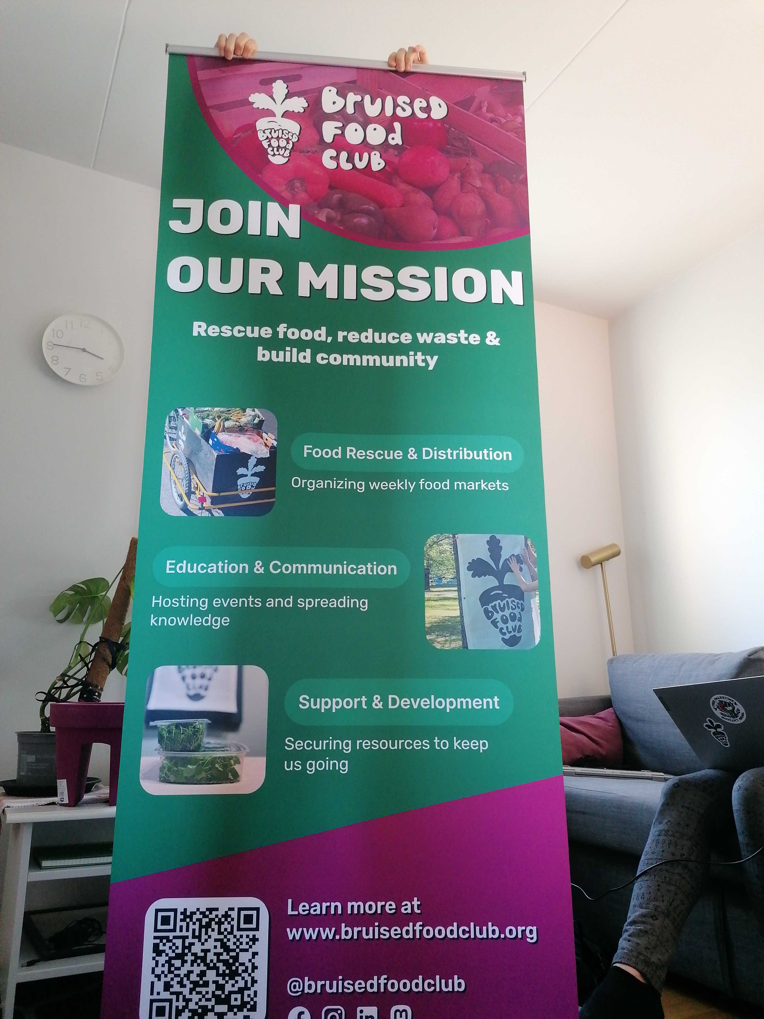
Rollup design
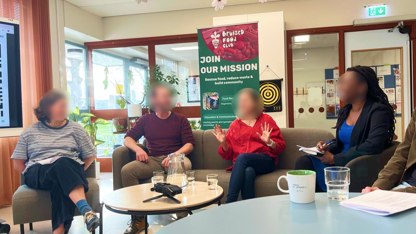
And I'm happy to see that they use it for their events.